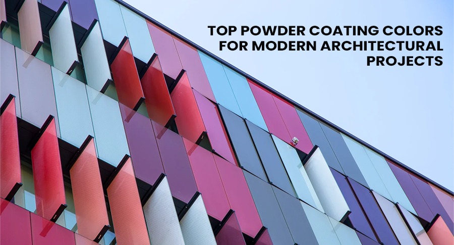
Modern architecture focuses equally on the efficient use of materials and the visual appeal of the structure. Works ranging from elegant commercial buildings to modern residential developments, are the results of the thorough detailing of every surface by the designers, which in turn is their contribution to the building’s overall identity. As the variety of finishing methods widen, architectural powder coating stands out as the leading choice of architects, designers, and builders that require this method as a solution for their problems of durability, aesthetics, and value in the long run.
Color selection is probably the most significant decision within this process. The most suitable powder coating color of a building is an aesthetic tool that goes beyond the visual appearance. It supports the shape of the building, interacts with the light, helps sustainability, and resists weathering. This piece of writing introduces the most common and functional powder coating colors in modern architectural projects and the reasons why they are the leading colors of design.
Before touching on the subject of color, it is pivotal to point out the factors that have led to the widespread utilization of powder coating for architecture. Powder coating is different from liquid paints in a way that it is done in a dry state and later cured by heat to give a hard finish of an even thickness. A major attribute of this process is that the resulting finish is not only very attractive but also very durable against rust, sun, moisture, and general wear.
Architectural applications i.e. the building faade, balconies, window frames, sunshades, pergolas, outdoor metal features, etc. are the ones that demand the use of the most durable finishes which can pass the test of weather conditions over time and at the same time keep their look. Exterior powder coating for architecture can fulfill these requirements and still allow for a wide range of color options and textures as well as large area uniformity.
Color in modern architecture is seldom solely decorative. It serves a purpose, reflects the surroundings, and is used very deliberately. Neutrals are the main colors of a lot of modern architectural works with the energetic hues playing the role of a spark to create the contrast, the identity, or the rhythm.
A good powder coating color can:
Hence the choice of the right powder coating color should be guided by a combination of the aesthetic sense and the practicality.
Black aside from several other features, one of which is enhancing the modern looks of architectural designs that are minimalistic in nature is what makes matte black remain at the top of the architectural powder coating color choices. What attracts most people to it is its capacity to give the structure the needed limelight without doing way too much work visually.
Among other items black powder coating is typically implemented on:
With an absorption of light that is gentle, black in its matt finish, effects a significant reduction in the glare while it is geometry that is left highly emphasized. This color goes particularly well with transparent structures, raw concrete, and natural materials and thus may be considered as a dependable ally of the architects who target a striking yet timeless result.
Grey plays a leading role in modern architecture. It is a color that is very versatile and neutral yet does not give that flat impression. Especially charcoal grey, and anthracite are among the most favored tones of the large-scale architectonic elements.
These shades provide the greatest value for:
Grey powder coating used on the architecture of the building in a darker tone is characterized by brilliance in terms of its dirt-hiding capabilities while it still manages to maintain a high-end look. The cities and the forests are all great places for a metallic grey housing project to adapt and blend in, therefore, giving the construction industry almost unlimited possibilities for their great works to be in varied locations.
Strictly speaking, white can be magnificent, however, architectural designers mostly go for warmer white or off-white powder coating colors. Both these colors give out the brightness; however, it is without the harshness of the light and the light is reflected more evenly.
Warm whites are very often found in:
– Houses exteriors
– Balconies constructions
– Pergola and exterior frames
– Interior metal architectural elements
On the other hand, lighter powder coating colors perform better as they limit heat absorption which can be a great advantage in hot areas. In architectural powder coating, off-white tones can express purity, simplicity, and are everlasting in style.
Among modern architectural design trends, the use of the bronze metal finish is a prominent one. This metallic bronze, champagne, and soft copper tone have a great appeal in the architectonic projects that are looking to instill a sense of luxury or warmth. The subtle, consistent, and maintenance free characteristics of these hues are what make them preferable to the raw metal.
They are most commonly used for:
– Handrails and balustrades.
– Decorative screens and panels
– The structure surrounding the entry door
One of the characteristics of a metallic powder coating finish is its gently reflecting light nature that causes the finish to be visually different at various times of the day. It is this change that makes it attractive to the residential spaces and the business ones of the higher category.
Neutral earth-tone colors that are inspired by rocks, sand, and clay are the styles that this type of architecture adopts. These are the ones that emphasize the interaction between the building and the surroundings. Among such colors are beige, taupe, sandstone, and muted brown that blend perfectly with nature-made materials.
As powder coating for architecture, these tones are suitable for:
– Small apartment blocks
– The buildings that are integrated into the landscape
– The metal structures, which are situated outdoors
– The metal parts of the fencing and the railings in the architecture
The main purpose of such colors is to make the differences less obvious. As a result, not only do they make the building structures look like they belong to the earth but are also contextually appropriate.
First of all, the green tones, which mainly consist of the muted olive, sage, and grey-green, have become quite popular in the architectural sphere that is devoted to the issues of sustainability and biophilia. These colors are in harmony with the natural surroundings and still keep their modern vibe.
Sustainable Architecture Components:
The green shades, if not overused, can be a powerful instrument to communicate the care of the environment while at the same time adhering to the rules of modern style.
While on the whole, old primary colors are hardly seen in modern architecture, the usage of deep blue color such as one of the accent elements is not completely ruled out. Navy and steel-blue powder coating colors could be considered quite tasteful and impersonal at the same time.
These colors will fit perfectly in:
– Feature columns or panels
– Architectural highlights
– Commercial branding elements
In the architectural powder coating systems, deep blues are usually surrounded by other colors to keep the balance and consistent color family.
The truth is that color alone does not determine the overall look of architectural powder coating; texture has a significant share in this as well. Besides the color, choosing between matte, satin, fine texture, and smooth can totally change the way one perceives the given color.
For instance:
Finishes that are intended for contemporary architectural projects cannot age in years but should rather last for decades. The powder coating systems which are to be used in architecture should be able to resist the following:
Keeping the color stable is of utmost importance for faades and outdoor elements.
In general, lighter and neutral shades are more long lasting in terms of looks, but a good quality architectural powder coating system will guarantee performance in the long run for any color that is chosen.
Different projects require different colors. Soft, neutral color schemes are often the right choice for residential architecture, as they evoke a sense of coziness. On the other hand, commercial buildings may utilize dark, powerful colors to convey authority and create brand awareness.
Figuring out the relationships between powder coating for architecture, building function, user experience, and surroundings is the key to getting a final result that is more than just the sum of its parts.
The selection of the color, even if it is impeccable, may not bring the desired outcome if the coating process is not carried out properly. For architectural powder coating, it is necessary that the operations of surface preparation, application, and curing are done in a controlled manner to achieve uniformity and strength.
SHAWH provides architectural powder coating solutions that are tailored to fulfill not only the performance requirements but also the aesthetic ones of the modern building industry. The high standard of powder coated finishes and their focus on color uniformity, surface excellence, and endurance over time are the main reasons why such finishes are a major contributory factor to the longevity of architectural designs.
A flagship entity under the Nagpal Group, Shawh G.V. Pvt. Ltd. has been a cornerstone of India’s industrial and decorative coatings landscape for over three decades.
Copyright © 2025 Shawh G.V. Pvt. Ltd.